In the last couple of months, I’ve gotten the opportunity to work on several types of projects. Because I’m me, that’s also meant I’ve fallen into a couple of research-holes. As I’ve gotten the opportunity to work with a couple of different companies on their websites, one of those “holes” was about building onepagers versus multi-page websites, and what the most important elements in doing so. Now, at some point in the past, I actually took the principle of a onepager for this site, but as per the usual: if I’m doing it for someone else, I like to really make sure I know what I’m doing.
For example, did you know that, according to OCreations, at least, onepagers are usually more affordable? Sure, you have to put some (a lot of) extra thought into the design, but as you’re only creating one page, you will still be better of time- and thus money-wise. Say, for example, you want to focus on images, then a onepager will allow for you to increase the continuity of the story you’re telling. One example of this I really enjoyed, was Ninetyfour Photography – even just the first image you get from their site, catches your attention:
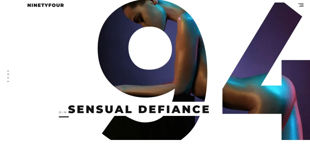

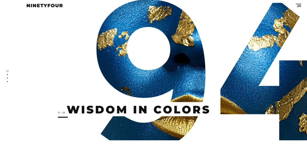

As soon as you scroll down, you notice that the style(s) reflect exactly what you see in those first four images (because let’s be real: this goes way beyond a picture). It’s something I’ve increasingly come to appreciate lately: continuity is key. And that continuity can be present in smaller elements as well: as you scroll to this onepager, Café Frida has a couple of visual elements which work beautifully to tie all the content together.
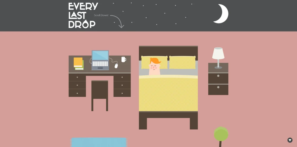
Another element which I “kind of guessed”, but which was nice to have confirmed: onepagers tend to be more mobile-friendly, as the user only needs to scroll, which also makes for easier navigation. Because of those elements, you will often see an increase in user engagement, compared to multi-page sites. Some sites even require it, and invite it in the very way they’ve been thought out and executed. One of the coolest onepagers I ever came across – which looks like it must have taken hours of such meticulous work, but WOW did it pay off? – does that perfectly. Every Last Drop: whoever thought of all of that? Pure genius.
An issue I came across for my site as well, was dealing with SEO. Especially when it comes to keyword targeting, a onepager isn’t always the optimal format to go for. After all, you generally want to make sure that your keywords are sufficiently specific, but how do you do that if “everything” has to on just that one page?
Another element which helps in getting you as high as possible in that list of Google search-results, is how quickly your site loads… And wouldn’t you know it, this is another point where onepagers actually tend to do at least slightly worse than multi-page sites. Especially when you lean heavily on the visual side of things, you can be faced with a loading time that far exceeds the couple of seconds (if that) most people are willing to wait for.
(If you want to know more on how, exactly, to get yourself on the top of the list for any Google search, I strongly recommend you check out Growl’s blog – it might just be because I do some revision for them, but I really feel that they manage to explain all of this a lot more clearly than I’ll ever be able to)
Finally, there is such a thing as “too much of a good thing”, and if you have a onepager, you might be getting close to that limit. Whether it’s because you just have a lot of information to share, or because you realise you need to add new information from time to time: scrolling can grow tiresome, so how do you determine where “enough” ends and runs into “too much”? And how do you keep your site at exactly that point? Maybe you’ve expanded the reach of your site, maybe you were missing something originally… Either way, onepagers don’t really allow for scalability as easily as, for example, a multiple page site which has a well-organised menu-section and makes clever use of categories and tags.
While I’ve certainly always been able to enjoy the aesthetic of a site, or the amount of thought with which it must’ve been created, I never really took the time to appreciate the fact that even as “simple” a choice as the one for a onepager or a multi-page site can shape or be shaped by an incredible amount of strategic thinking. And in classic “if I’m going down, I’m taking all of you with me” – hopefully, now, you won’t be able to unsee it either!